

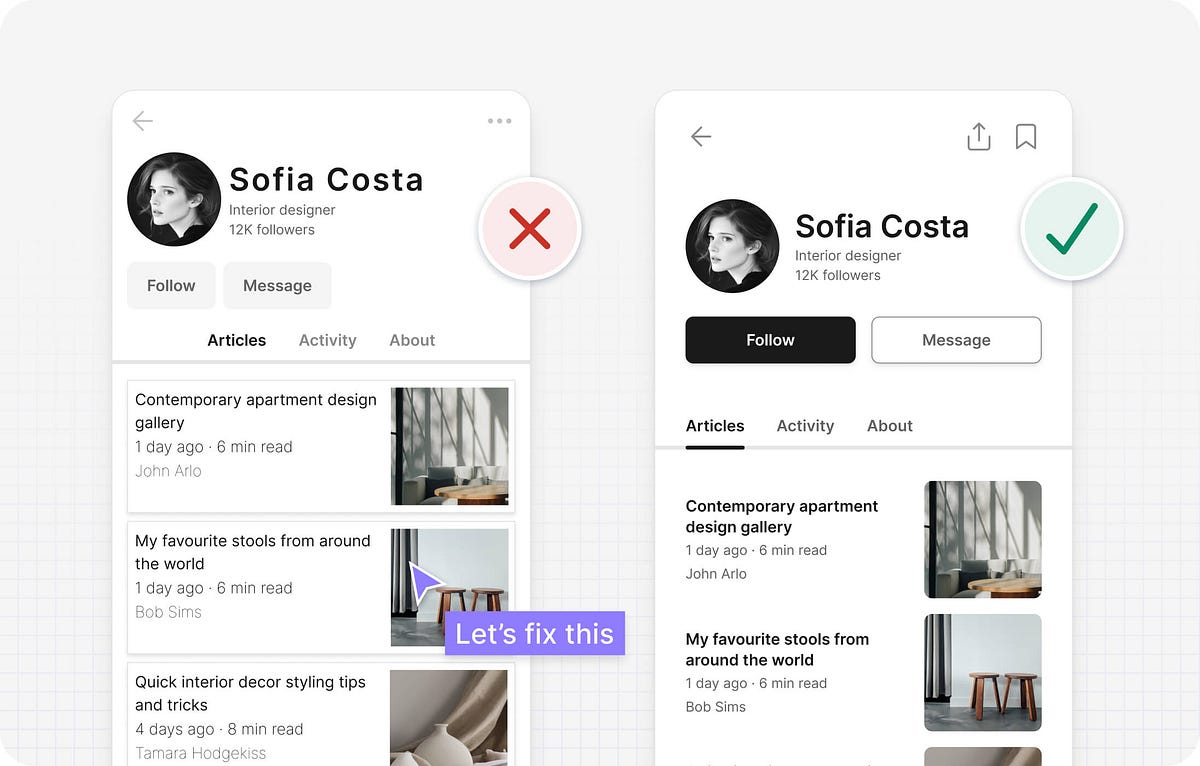
Visual designUsing color, typography, and layout to create attractive interfaces that effectively communicate information.
518 Visual design articles


22 Visual design tools
Photopea
Photopea.com is a free online tool for editing raster and vector graphics with support for PSD, AI, and Sketch files.

Vectorpea
Vectorpea.com is a free online tool for editing vector graphics with support for AI, PDF and SVG files.

Figurative
Love Figma? Love your iPad Pro? Meet Figurative.

Leonardo
Create beautiful, accessible, and adaptive color systems using contrast-ratio based generated colors.

Vectornator
Vectornator Pro makes your designs more powerful. Visualize every detail, explore the space and let your creativity run wild.

Accessible color palette builder
This is a tool to help designers build color palettes with combinations that conform with accessibility standards.

Sim Daltonism
The color blindness simulator.

Colorable
Take a set color palette and get contrast values for every possible combination – useful for finding safe color combinations with predefined colors and includes pass/fail scores for the WCAG accessibility guidelines.

Accessible Colours
We evaluate your color combination using the WCAG 2.0 guidelines for contrast accessibility. If your combination does not meet the guidelines, we find the closest accessible combination by modifying the color lightness.

Accessible brand colors
This tool shows you how ADA compliant your colors are in relation to each other. By adding your brand’s colors on the right, you can generate a chart to see how they can be used together for accessibility, and find similar colors that work better.

Colorblind Web Page Filter
Use the Colorblind Colorlab to select safe colors earlier in the design process.

Color Tool
Create, share, and apply color palettes to your UI, as well as measure the accessibility level of any color combination.

Colorbox
Comprehensive colour palette generator, now sponsored by Lyft.

Contrast
A macOS app for quick access to WCAG color contrast ratios.

Color Oracle
Design for the color impaired. A free color blindness simulator for Windows, Mac and Linux.

Color Safe
Empowering designers with beautiful and accessible color palettes based on WCAG Guidelines of text and background contrast ratios.

Figmac
A super lightweight Figma desktop app that delivers a more natural Mac experience.

Figma
Where teams design together. Design, prototype, and collaborate all in the browser.

Affinity Designer
The fastest, smoothest, most precise vector graphic design software available for Mac, Windows and iPad.

Sketch
The industry-leading tool for digital design.

Adobe XD
Adobe's UX design tool. Basically their answer to Sketch.

InVision Studio
Web-based design tool. Invision's version of Sketch.

4 Visual design books
Articulating Design Decisions
Tom Greever · O'Reilly
Talking to people about your designs might seem like a basic skill, but it can be difficult to do efficiently and well.
Visual design
Paid

Butterick's Practical Typography
Matthew Butterick · Matthew Butterick
Typography is the visual component of the written word. Thus, being a publisher of the written word necessarily means being a typographer. This book will make you a better typographer.
Visual design
Paid

The Shape of Design
Frank Chimero · Frank Chimero
Shape is a book about objectives, and it zooms out to answer a couple big questions: How does it feel to make things for other people? And how can we do so in a meaningful, engaged way?
Visual design
Paid

Visual Grammar
Christian Leborg · Princeton Architectural Press
Visual Grammar can help you speak and write about visual objects and their creative potential, and better understand the graphics that bombard you 24/7. It is both a primer on visual language and a visual dictionary of the fundamental aspects of graphic design.
Visual design
Paid
